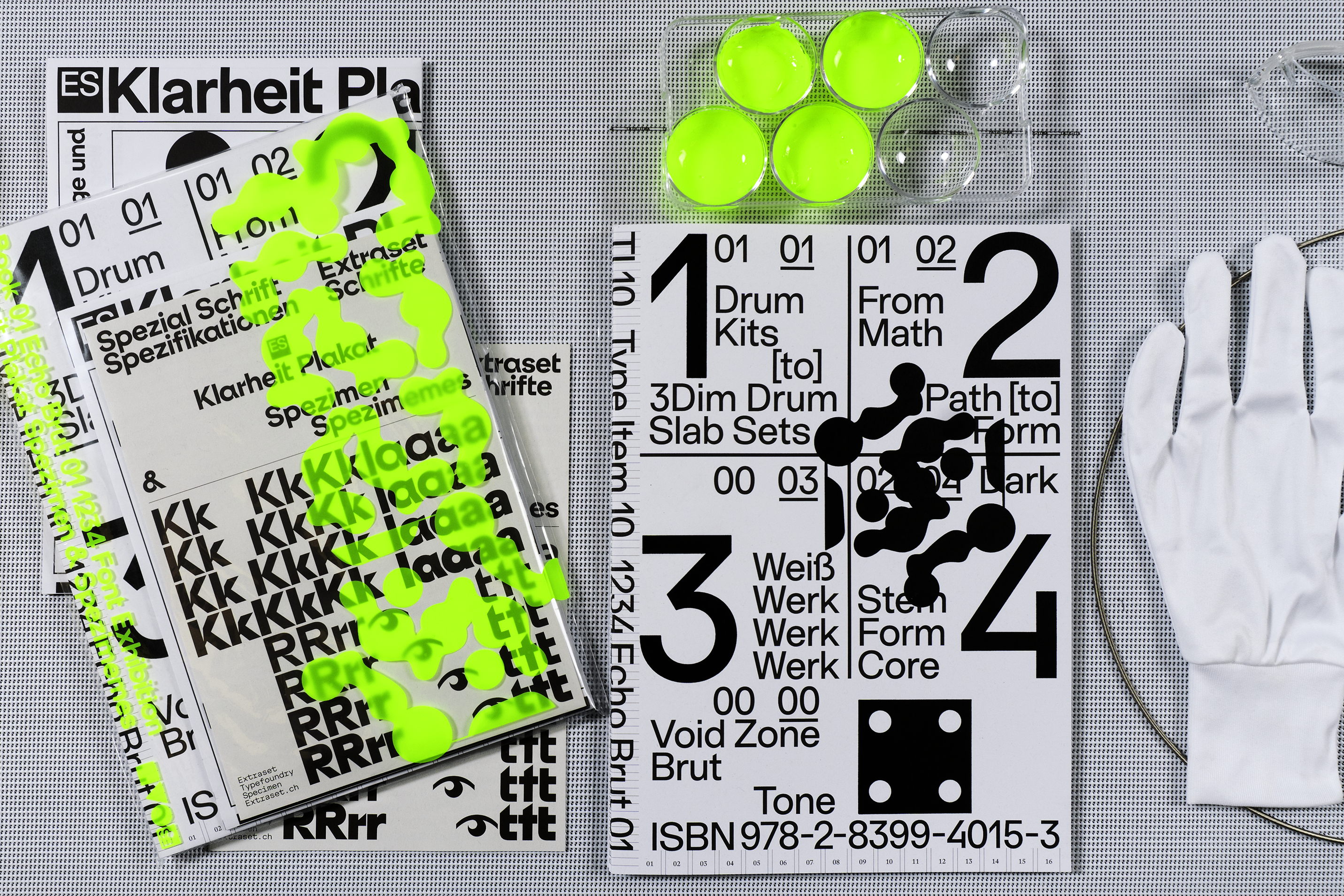
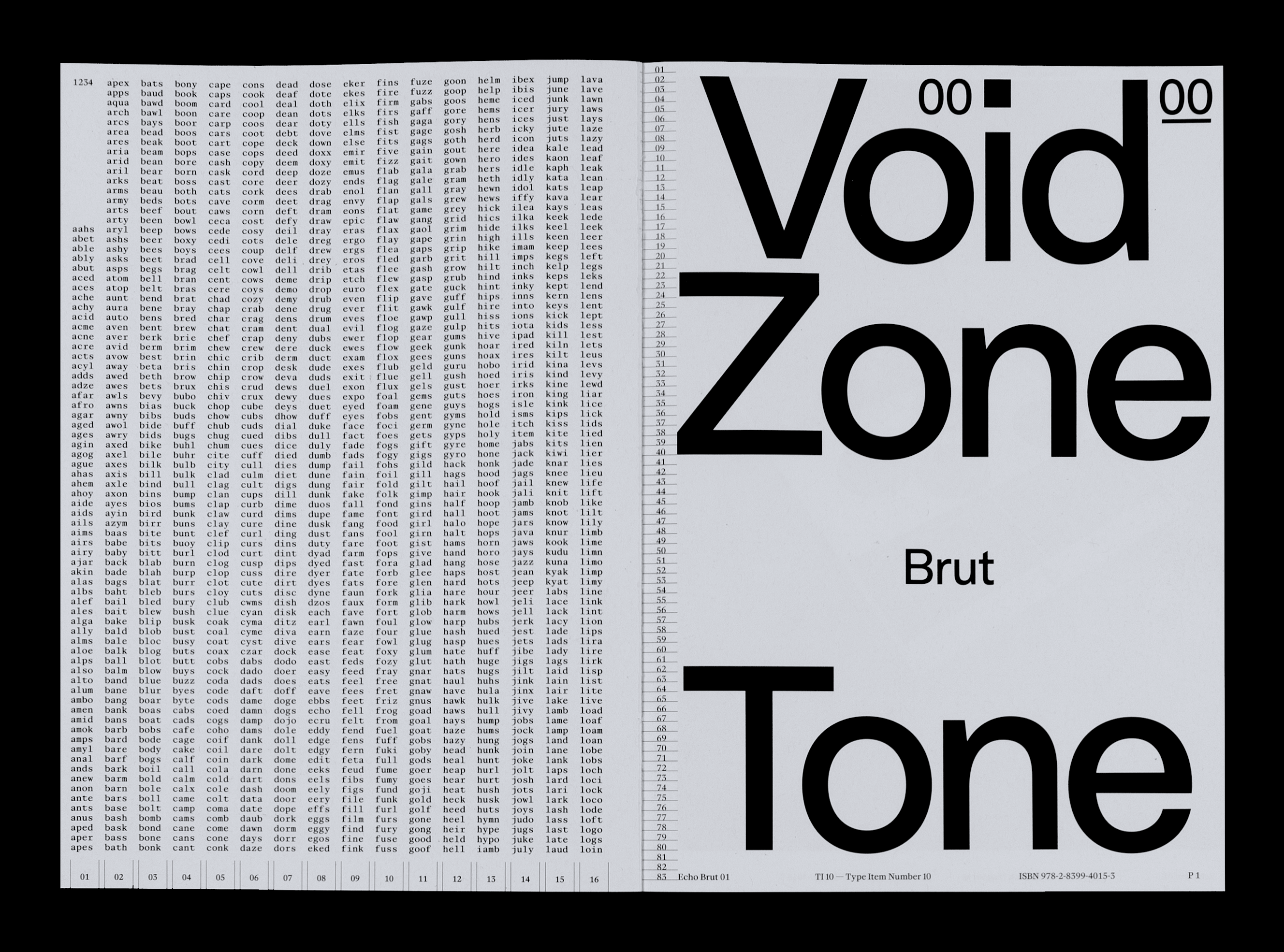
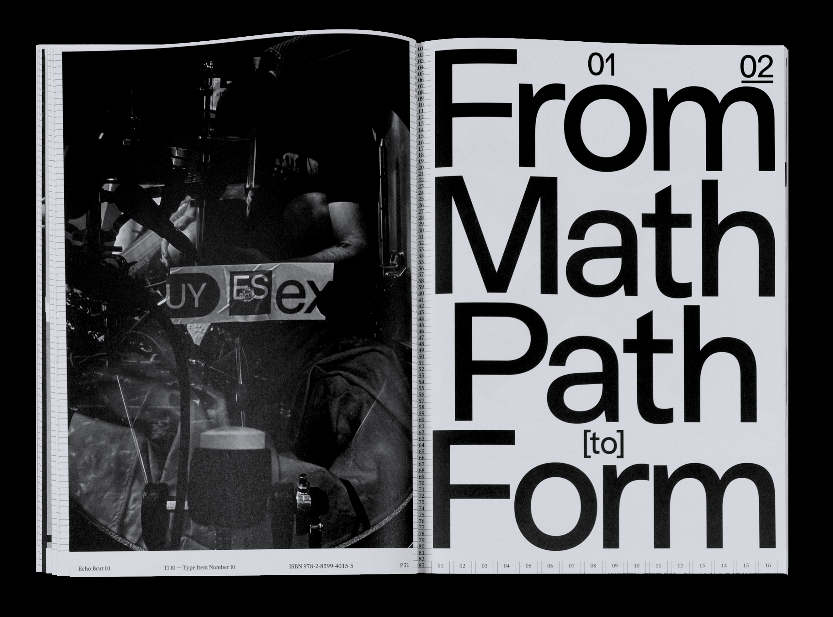
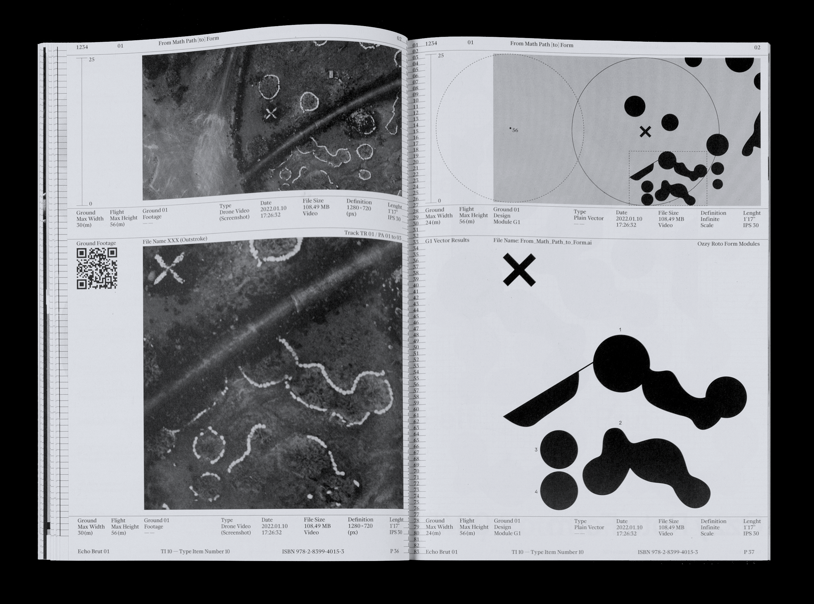
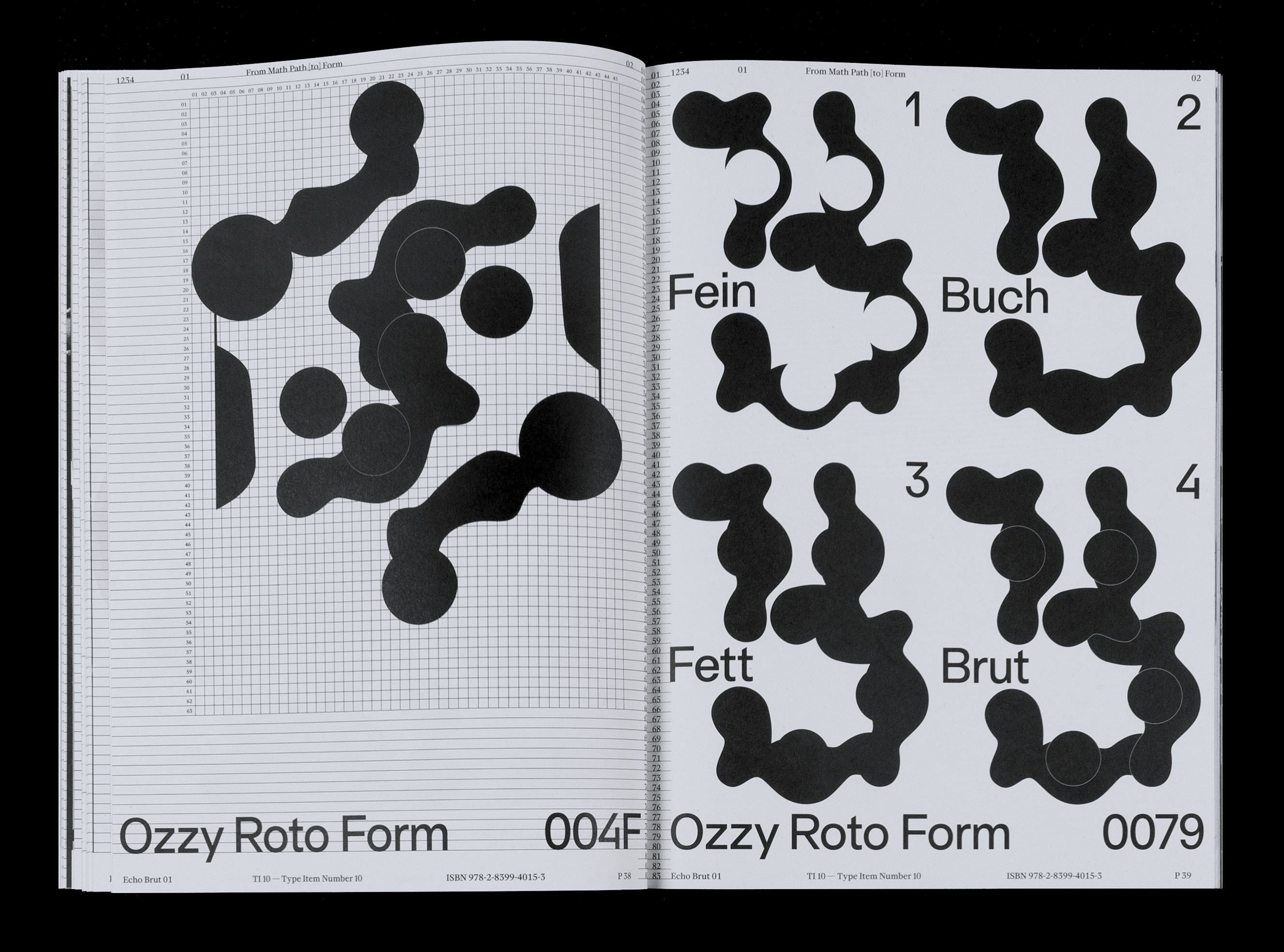
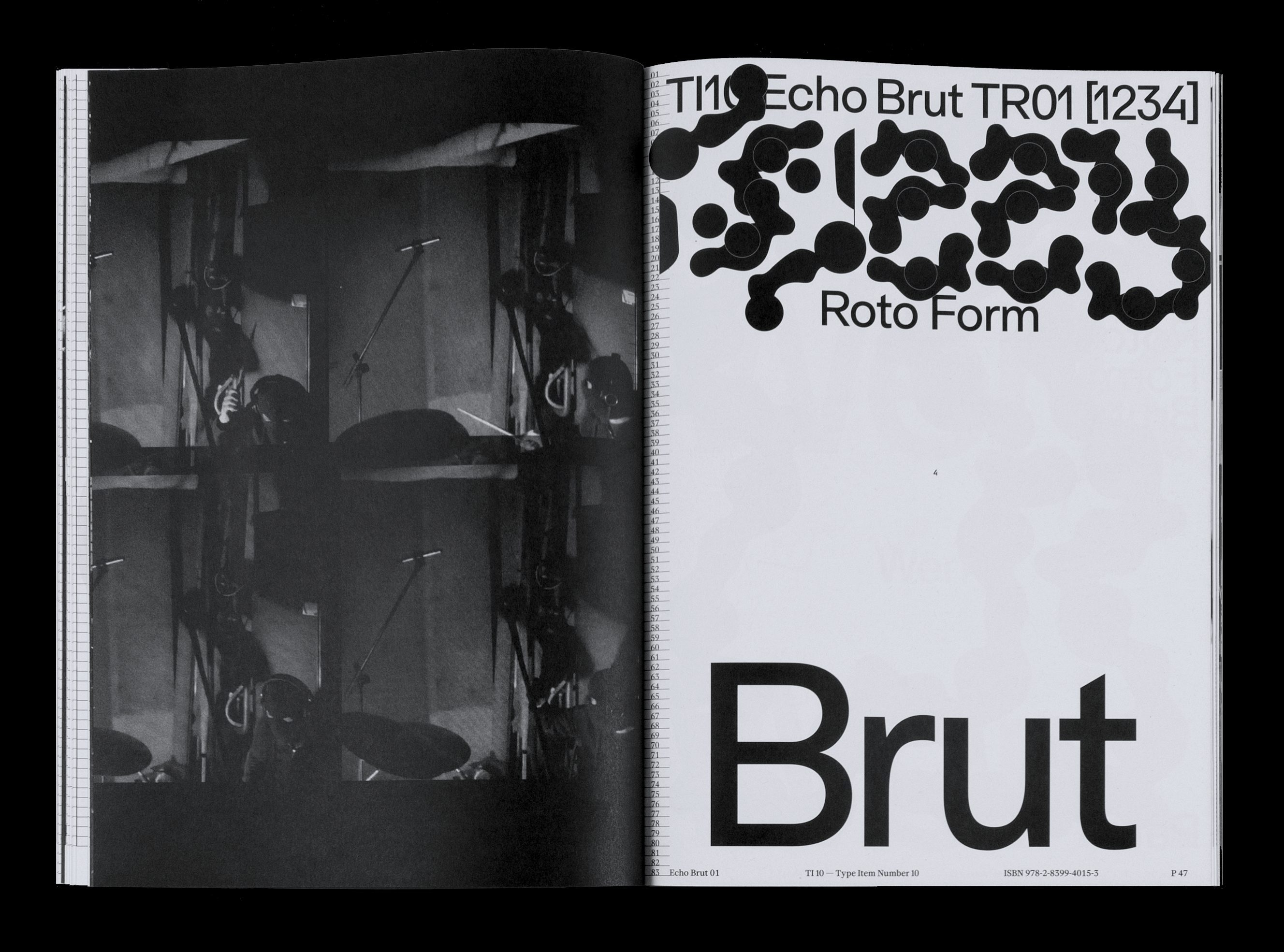
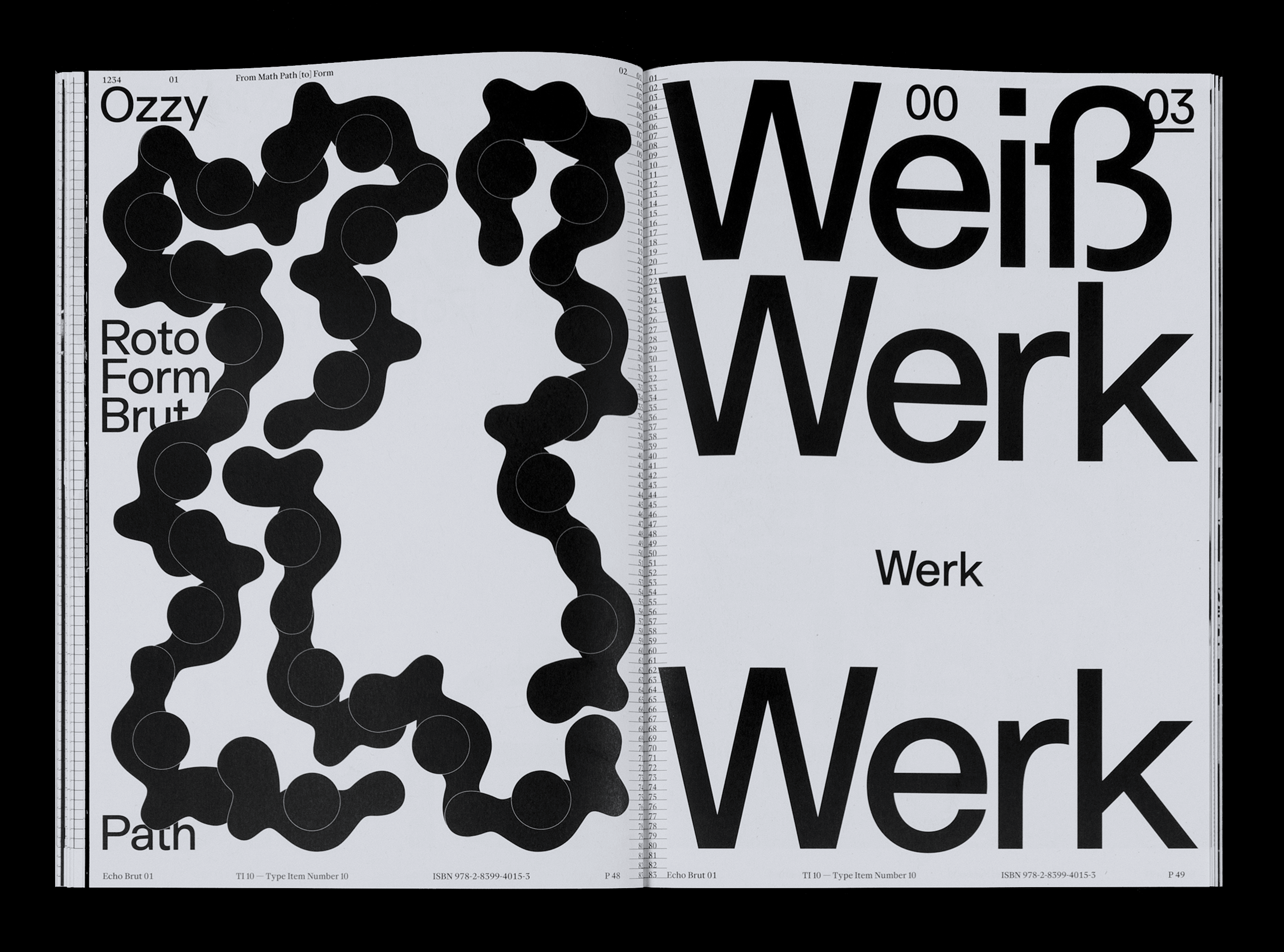
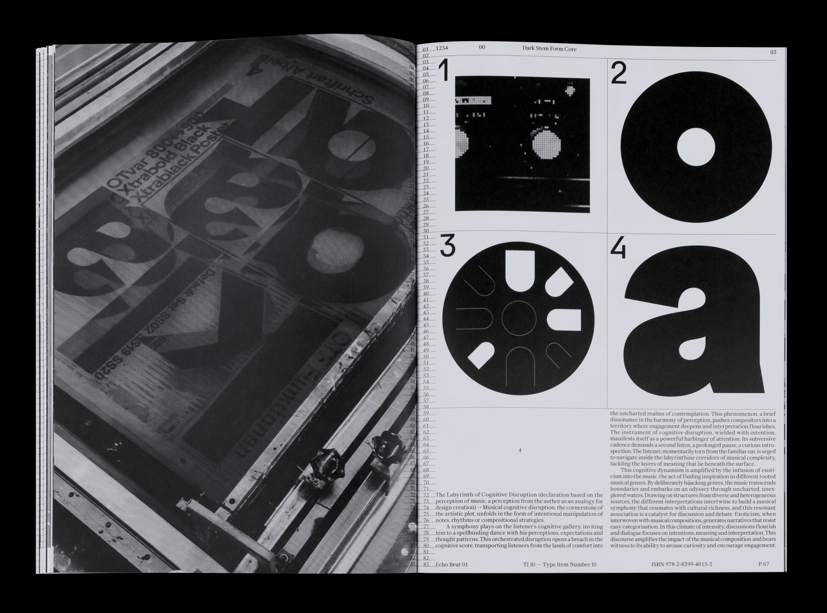
1234 Echo Brut 01 archives a series of 4 works presented in the eponymous exhibition invested by Alex Dujet (Futur Neue), in October 2023. In this complex interplay of partly interdisciplinary concepts, a series of experiments unfolds. An archive that resonates over 4 years of partial gestation, of exploration, and which attempts to cultivate a singular approach in terms of visual perception. These substances, these interwoven subjects, form a design philosophy that transcends aesthetics, becoming an orchestration of dialogue, introspection and evolution.
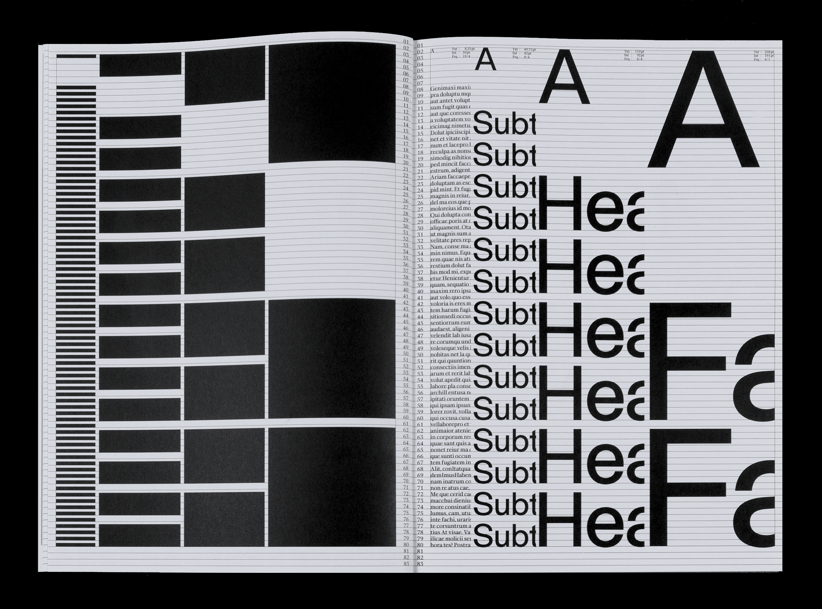
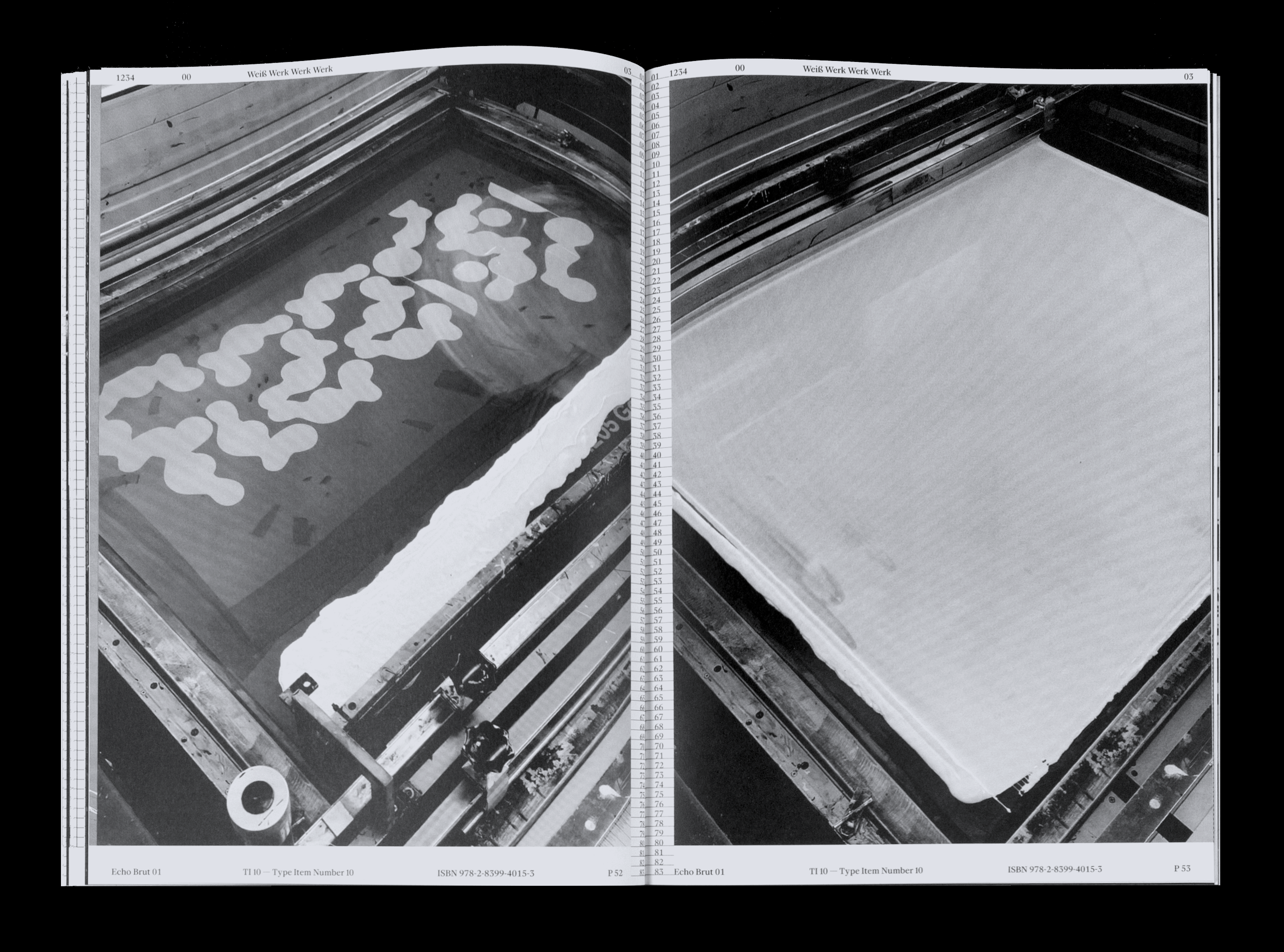
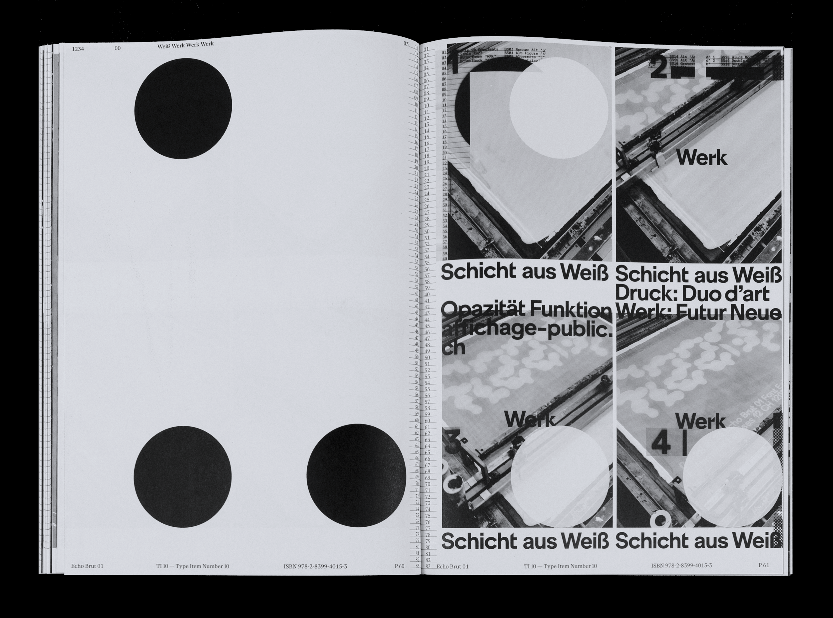
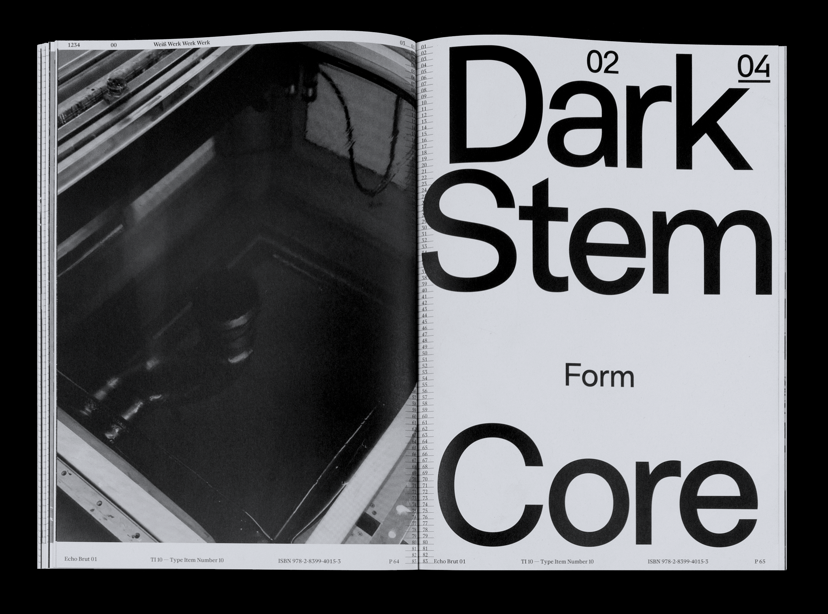
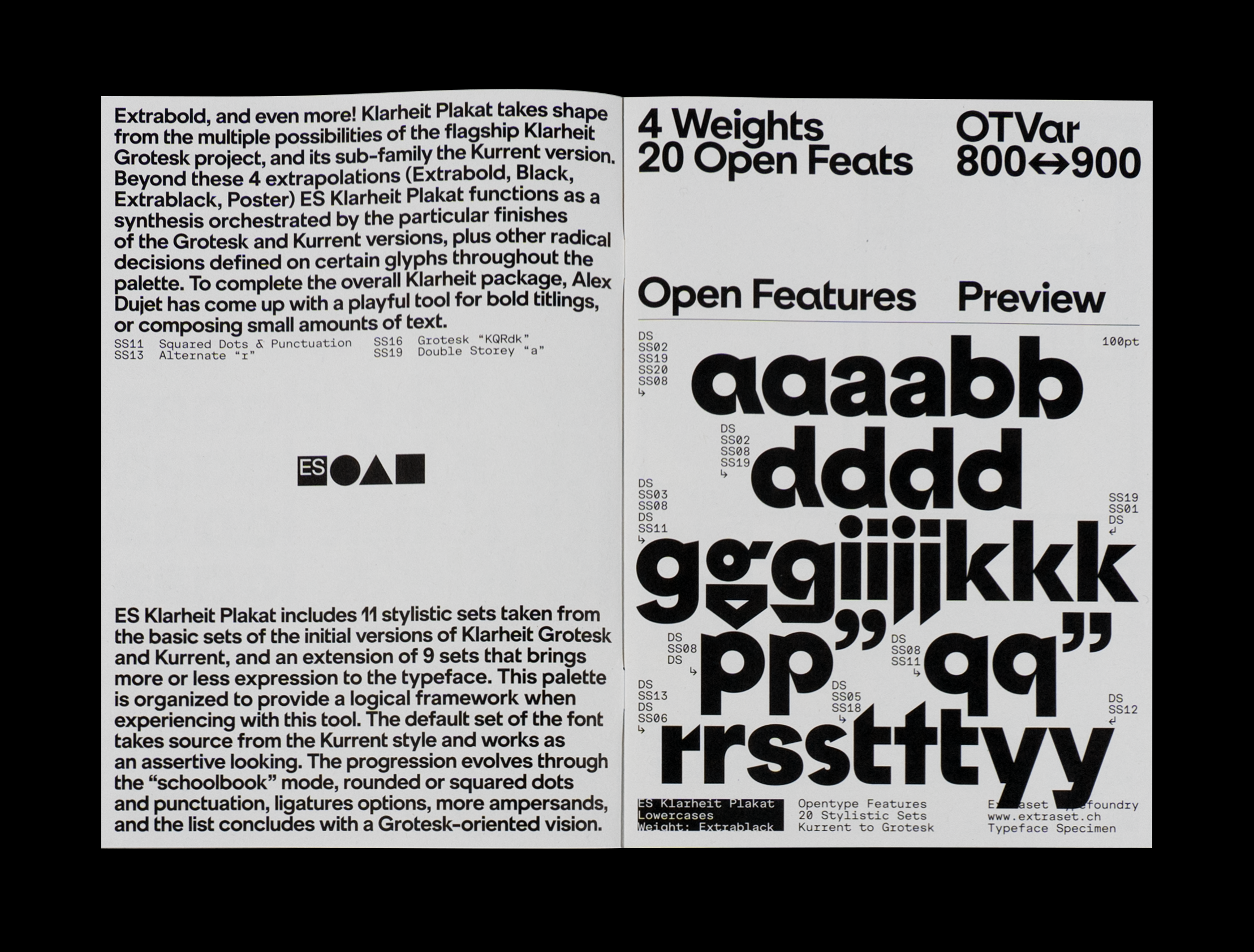
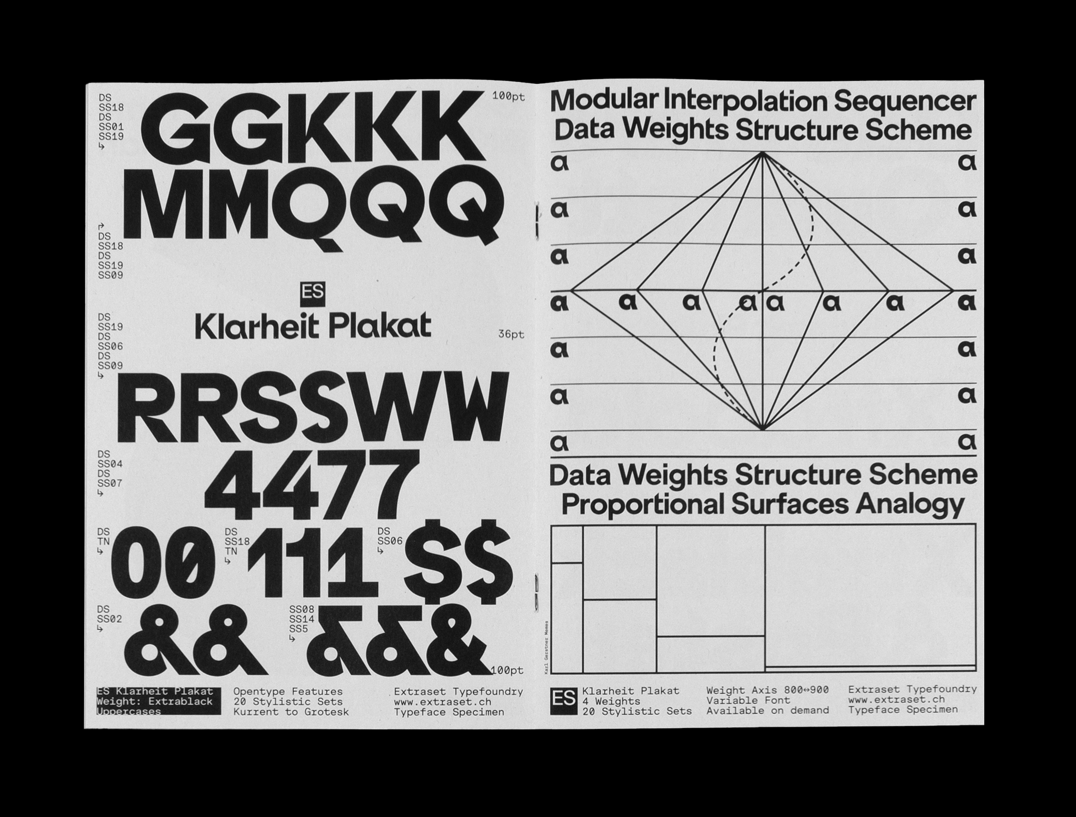
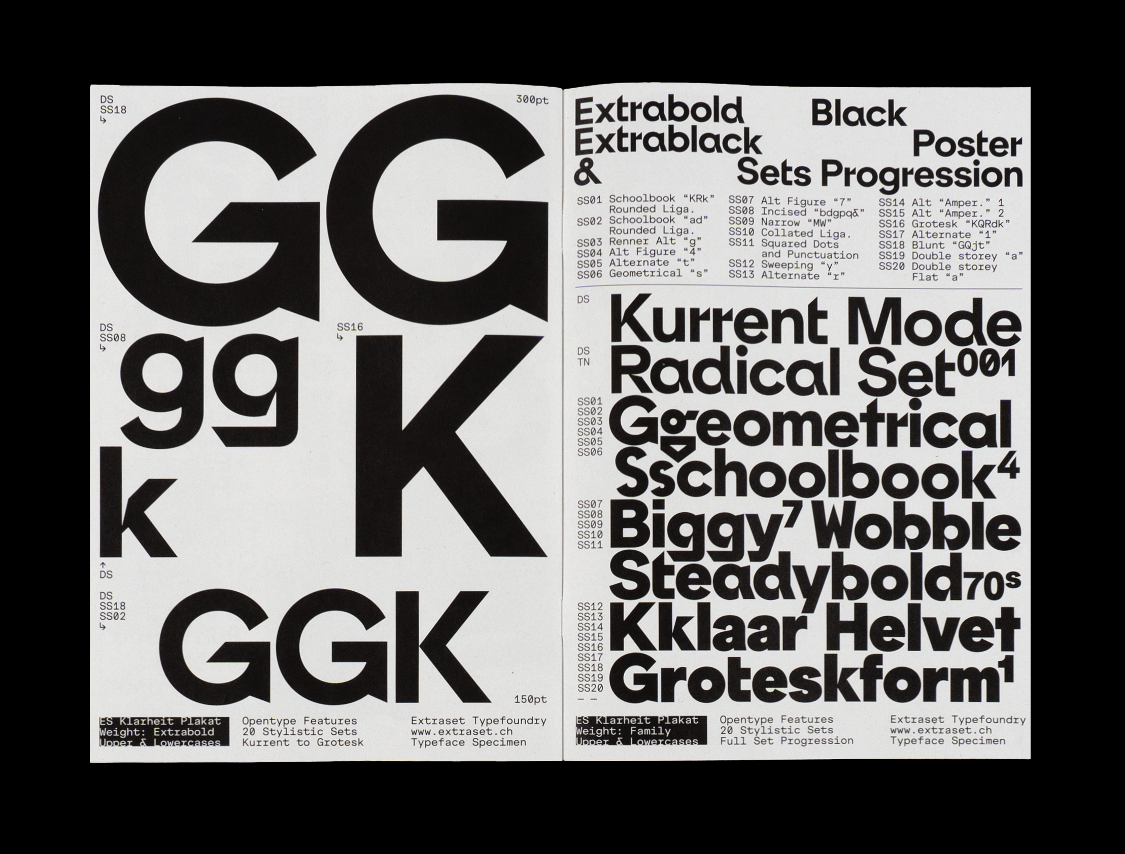
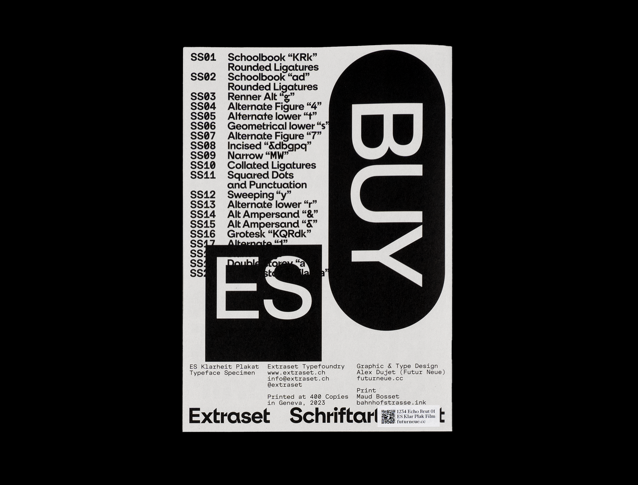
The subjects presented in this book have a dual nature, they illuminate and restrict, while at the same time being a source of deep inspiration, imposing constraints and blooming by their very essence. The tipping point in the creative growth of this project resides in the ability to discern the moment when attachment to tradition becomes an obstacle to innovation. This inflection point propels these experiments into a realm where they deliberately catalyse constraints, drawing on notions of freedom and escape. These breaks with convention crystallise in the creation of distinct design languages, each with its own idiosyncratic cadence. In essence, these tentatives cross partially the fine line between the familiar and the abnormal, creating a symphony where familiar harmony coexists with the inevitable desire of mutation. A mini specimen of ES Klarheit Plakat typeface is included with this edition since this font takes part as a key element in the module 4 of the exhibition “Dark Stem Form Core”. Printed at 400 copies in Geneva in 2023. Offset print and embossed with very old machines. Any question before or after placing an order, please contact: Alex Dujet
type@futurneue.cc
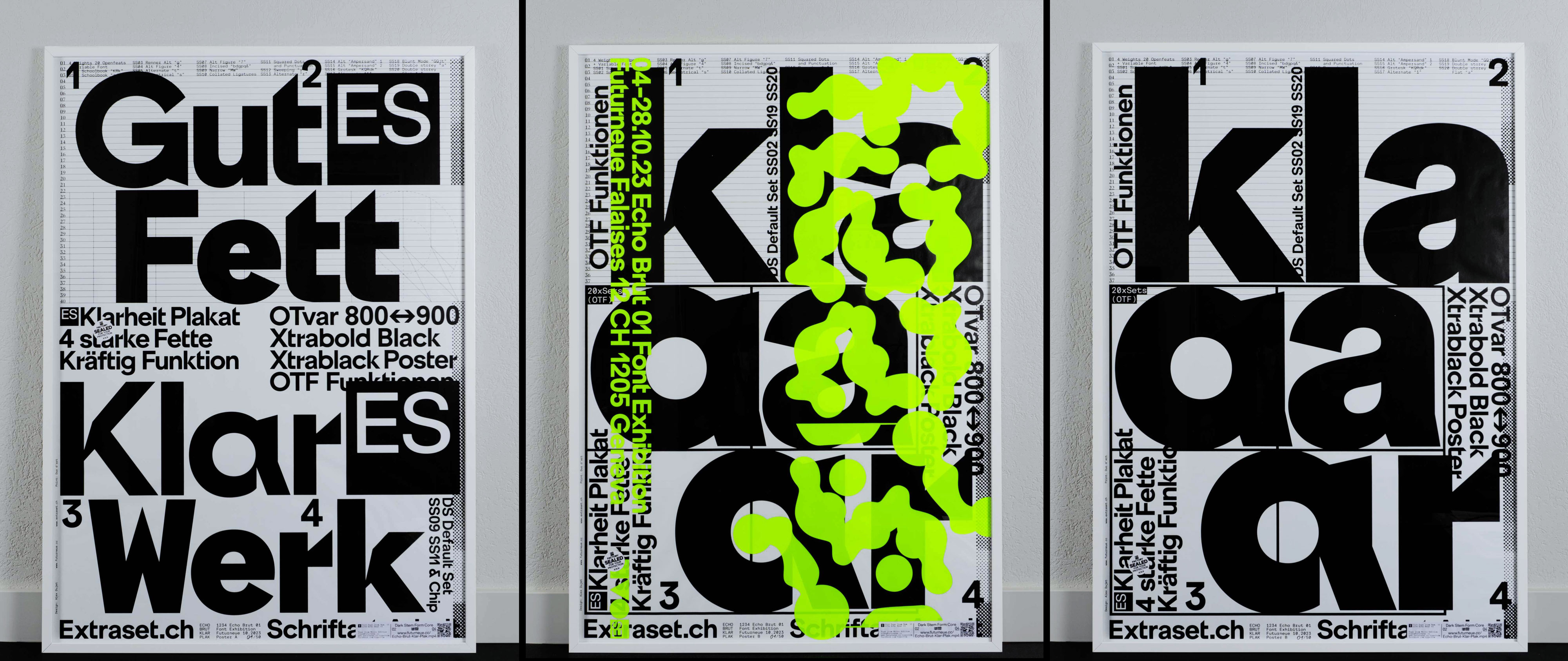
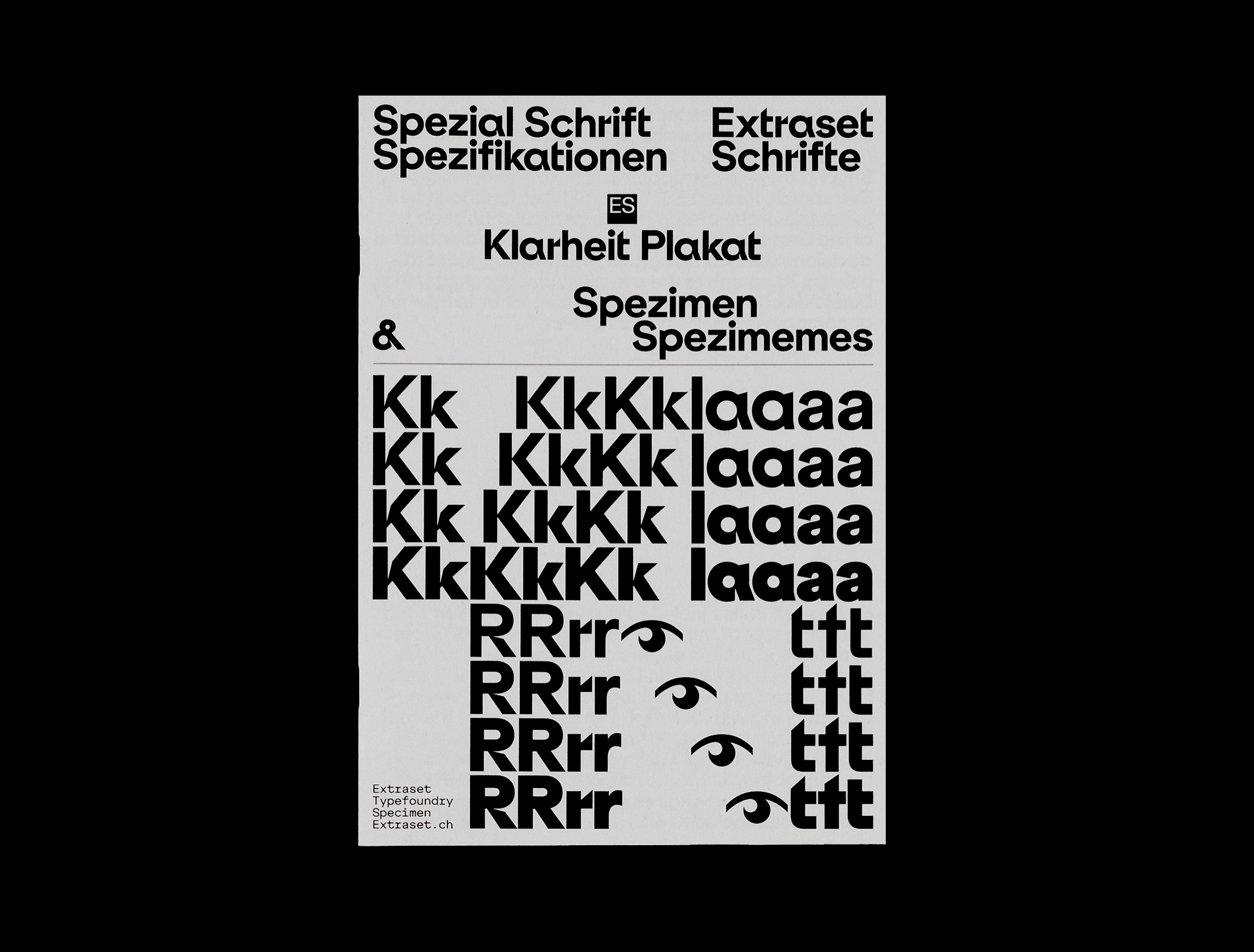
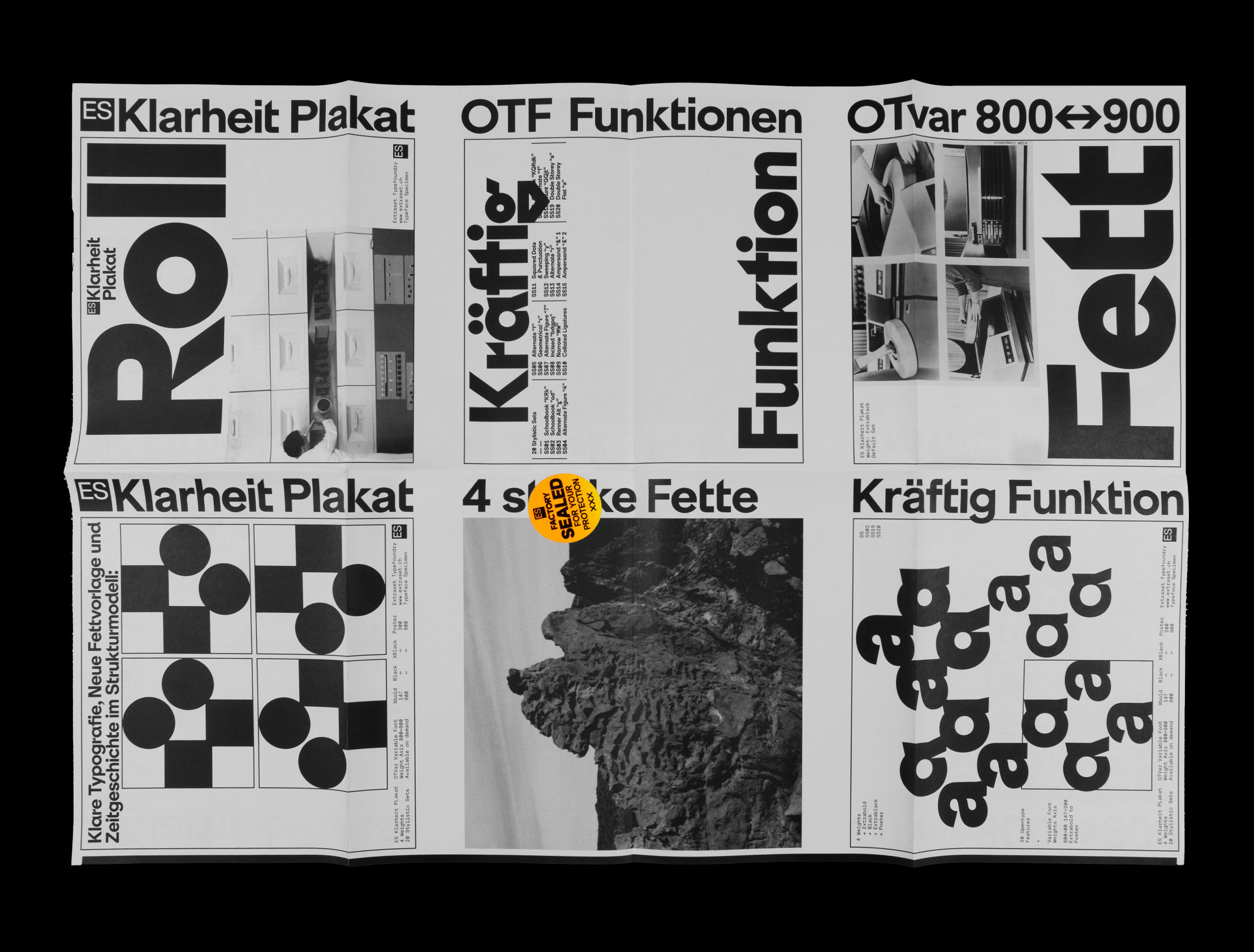
ES Klarheit Plakat Poster Series, 2023
Silkprint Size F4 (895x1280mm). Printed and numbered by hand at 50 copies each. Any question before or after placing an order, please contact: Alex Dujet
type@futurneue.cc
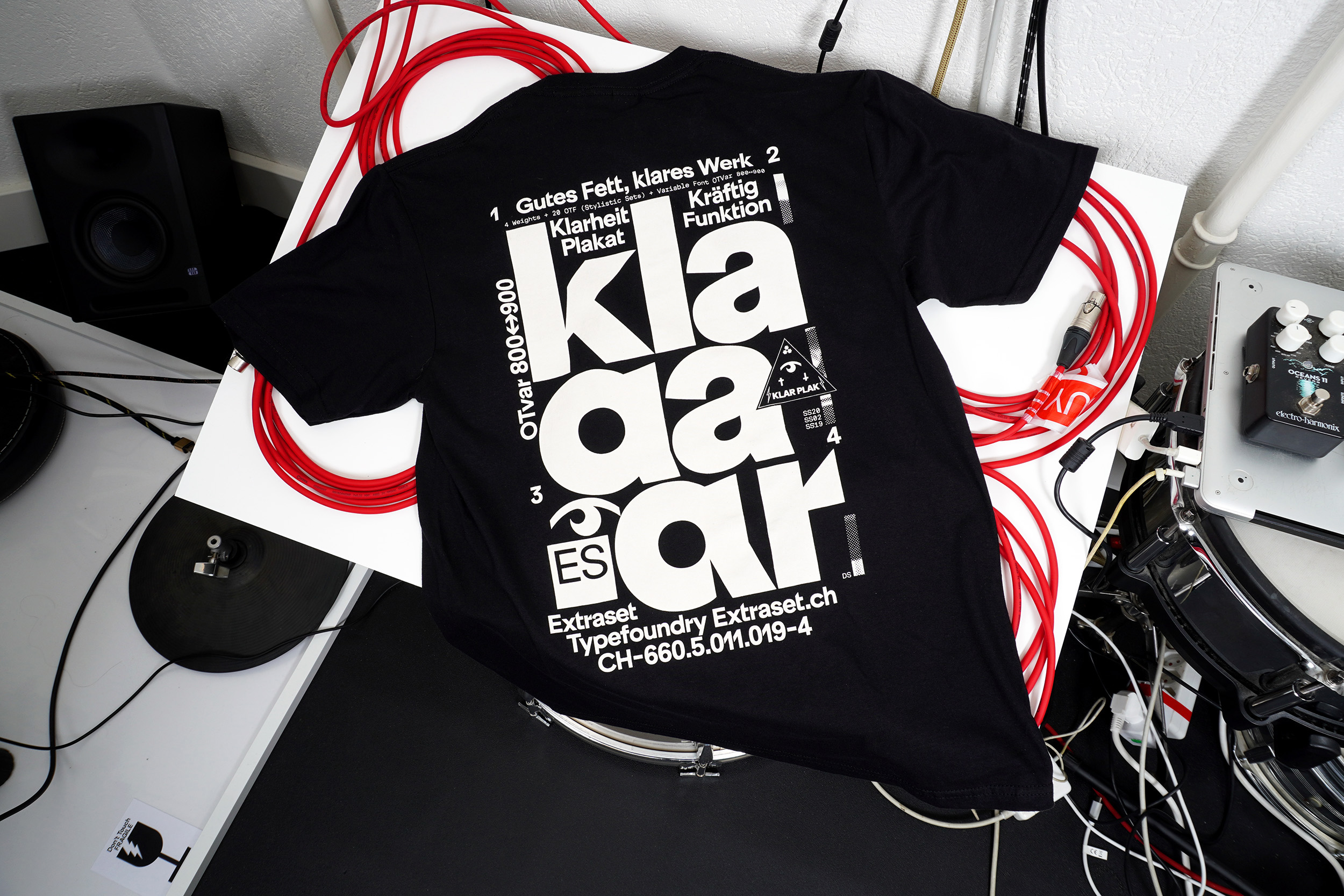
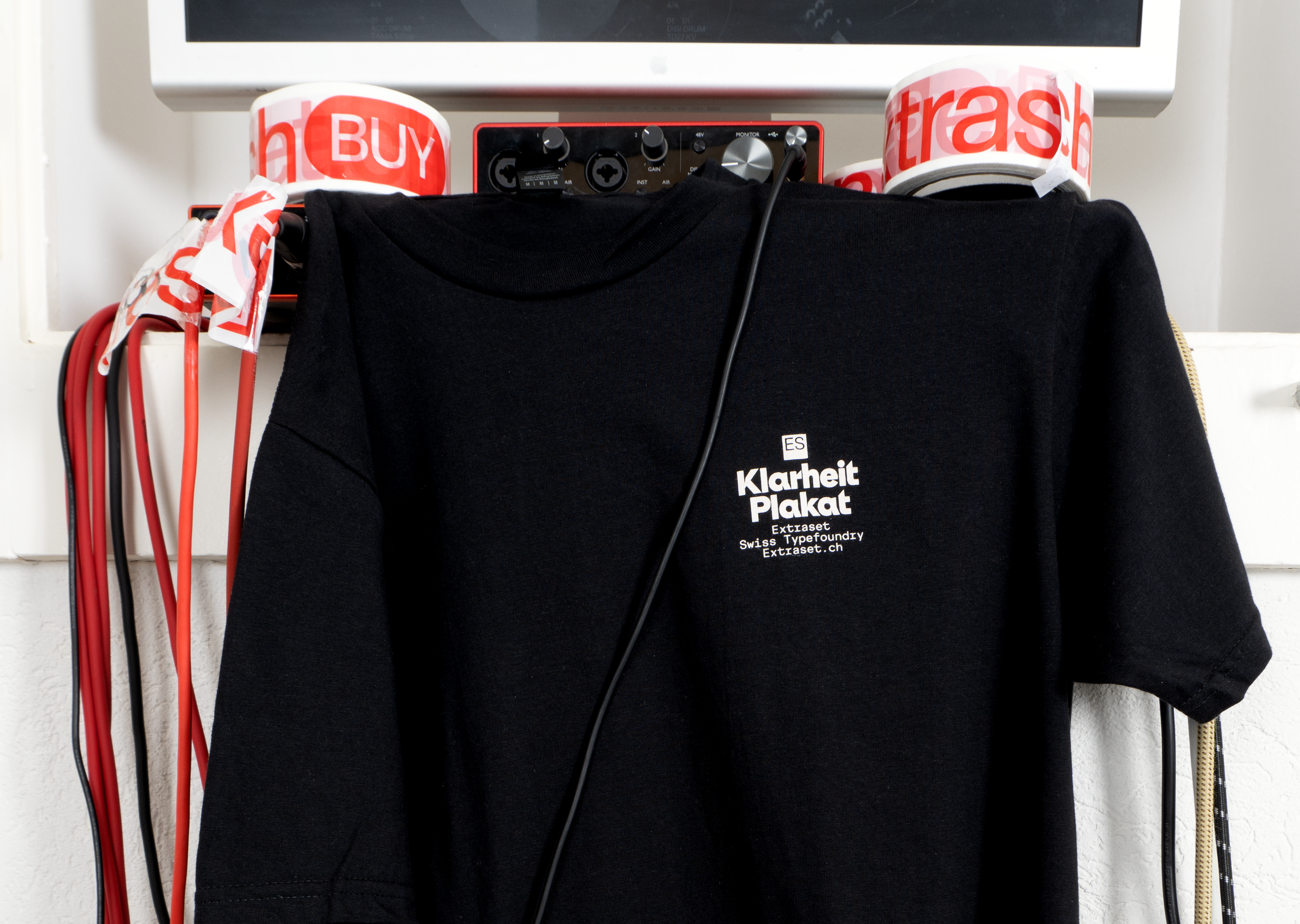
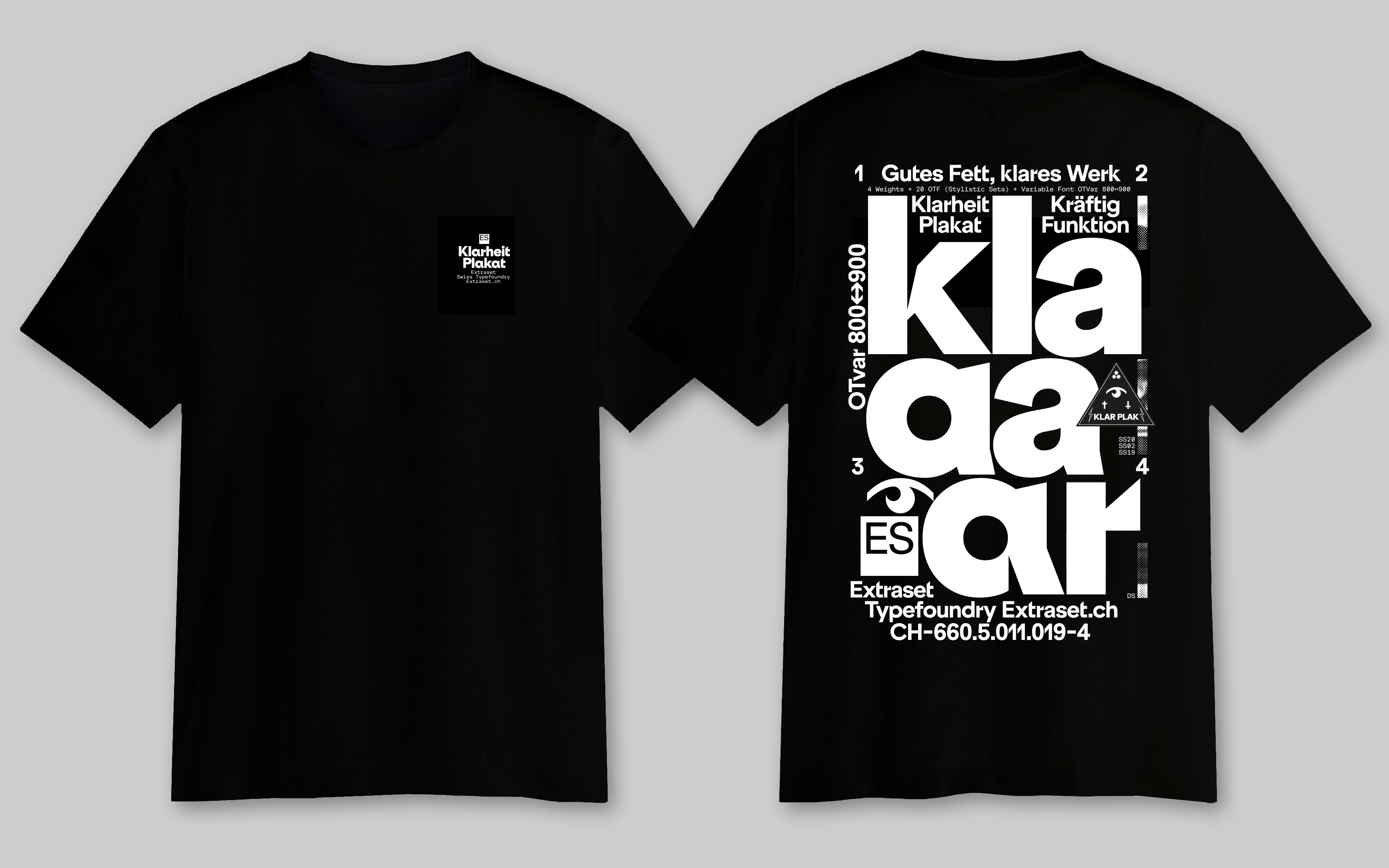
ES Klarheit Plakat Shirt, 2023
Size M, L, XL, silkprint with a discharge ink. Before or placing an order here, please mention the sizes and the number of shirts you are looking for, as well as if you have any question by sending an email at
type@futurneue.cc. Thank you!
Out of Print
Type Item Number 9
Floppie’s Grotesk
2017
Floppie’s Grotesk is a titling font inspired by the simple shape of a sweet. A playful, observational approach that gives rise to an atypical character. A specimen (out of print) demonstrates the project, using the code and iconic elements of the candy brand used. The font is made available for free for everyone to enjoy. Kids and grown-ups love it so, the happy world of Haribo!
Download the font for free
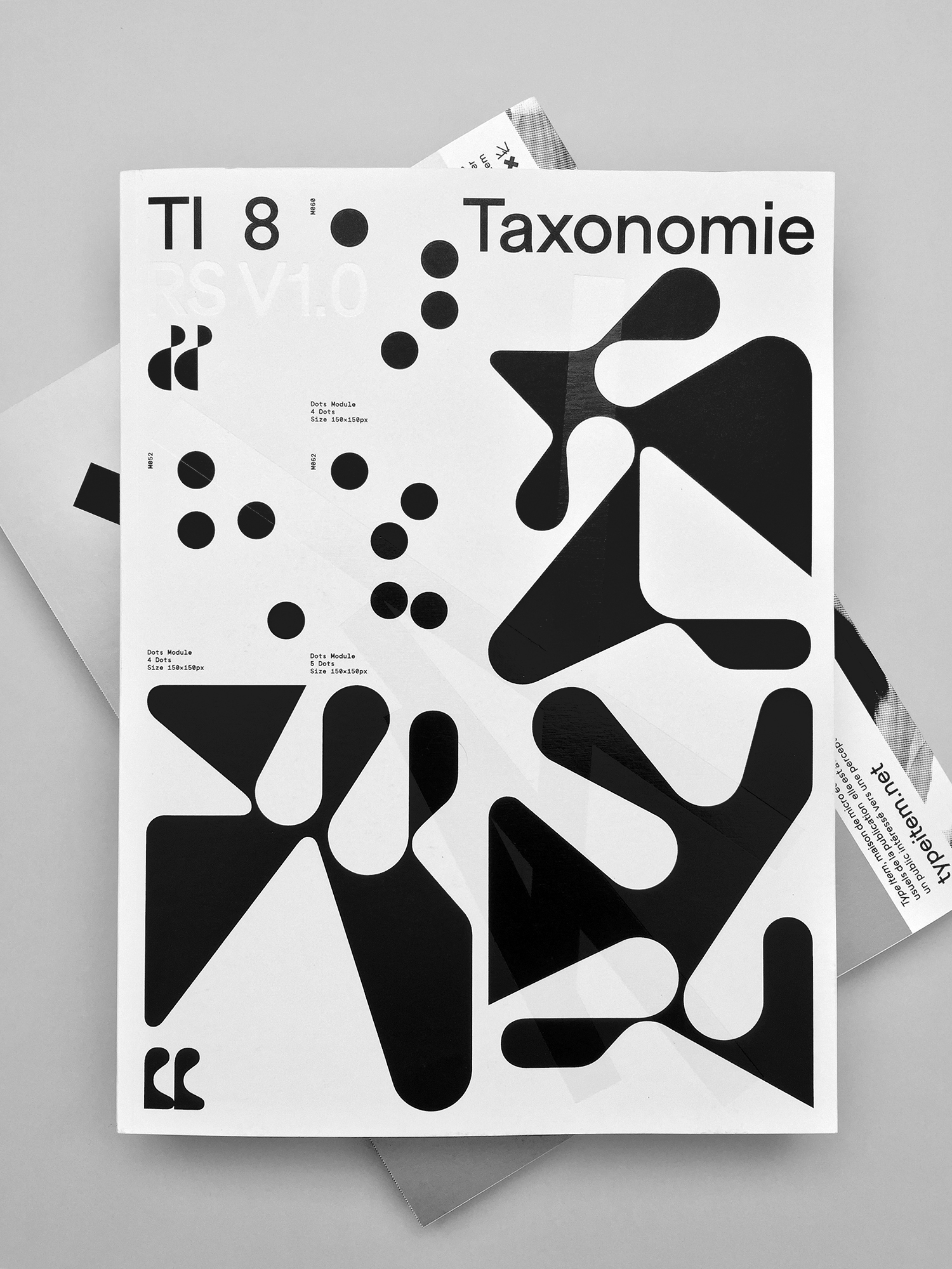
Type Item Number 8
Taxonomie
2017
Type Item 8 Taxonomy functions as a mini-anthology of the previous 7 issues, and is organised around the notions of ‘taxonomy’, a strategic educational plan invented by Benjamin Bloom in 1956. Throughout the book, amount of graphic experiments unfold, giving shape to a communications project to promote a small educational exhibition that took place at HEAD-Geneva in 2017.
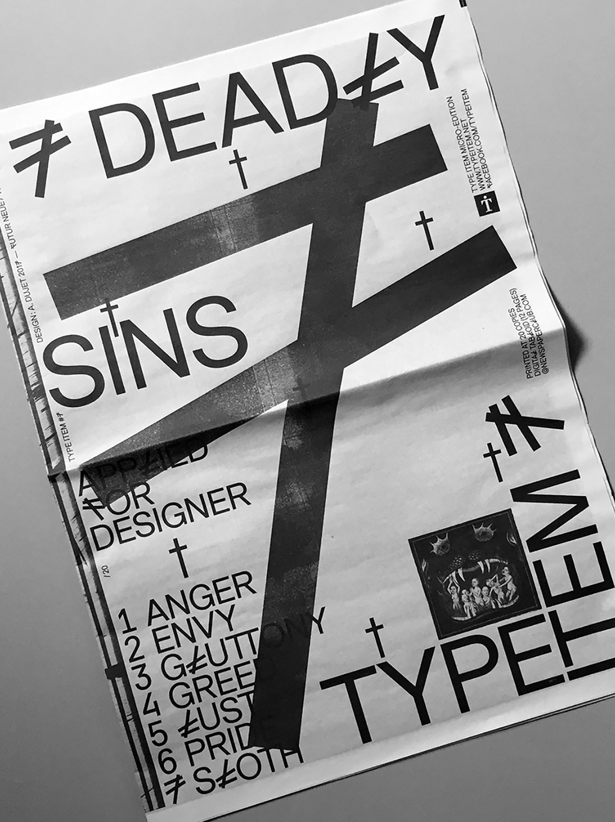
Type Item Number 7
7 Deadly Sins
2017
This little manifesto takes up the obscure theme of the 7 deadly sins. It functions as a playful guide to warn practitioners of certain situations caused by the vagaries of the graphic design profession. The paper is illustrated by the recovery of offset printing plates that have been smeared to the extreme, lending a dark atmosphere to the publication.
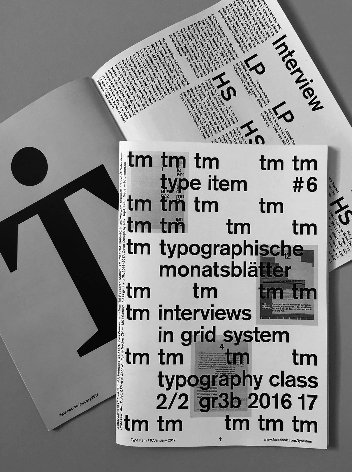
Type Item Number 6
Typographische Monatsblätter
2017
This document archives a series of layouts based on a modular grid built in relation to a selection of covers from the famous Swiss graphic design magazine Typographische Monatsblätter. Produced with third-year graphic design students at the CFP Arts in Geneva.
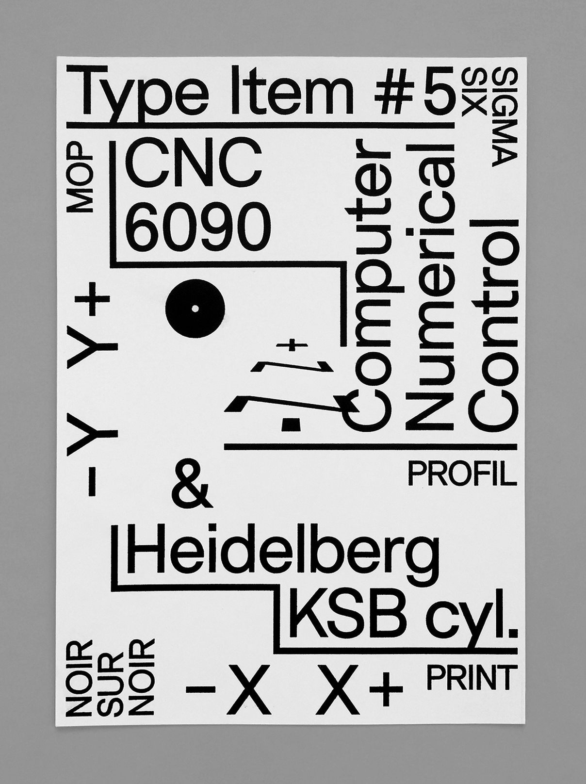
Type Item Number 5
CNC 6090 vs. Heidelberg KSB
2017
This small project was produced using an experimental printing process. The print was made using a CNC-carved wooden matrix based on a vector computer. The plate was then used in a vintage mechanical cylinder press (Heidelberg KSB Cylinder) to print a series of A3 posters.
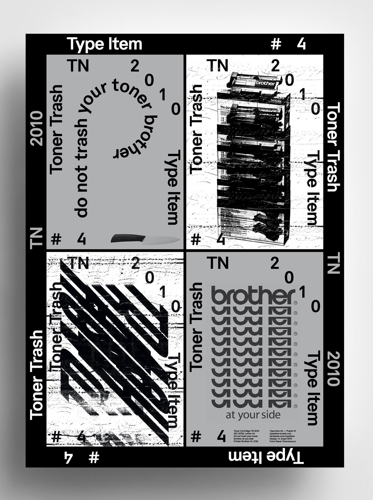
Type Item Number 4
Toner Trash TN 2010
2016
A series of 2 posters created by destroying a black and white laser printer toner. The typographical and pictural subjects taken from the from the brand Brother was contextualized and magnified.
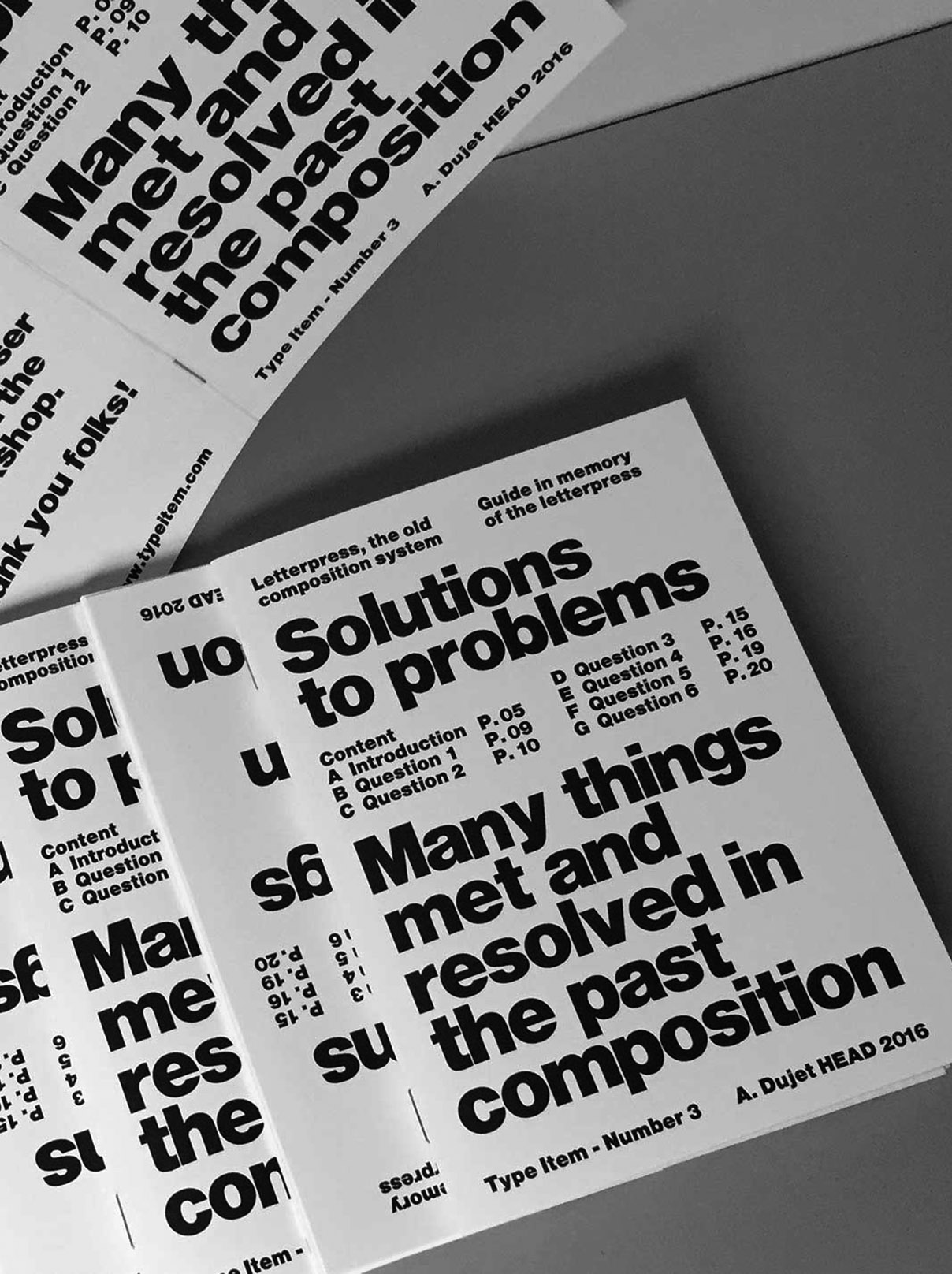
Type Item Number 3
Solutions To Problems
2016
This guide brings together a series of problems encountered during lead composition processes. It was created at HEAD Geneva during a course and with the help of Prof. Pierre-Alain Giesser. Type Item Number 3 is an object designed for educational purposes, to be shown to a student
at the start of his or her apprenticeship.
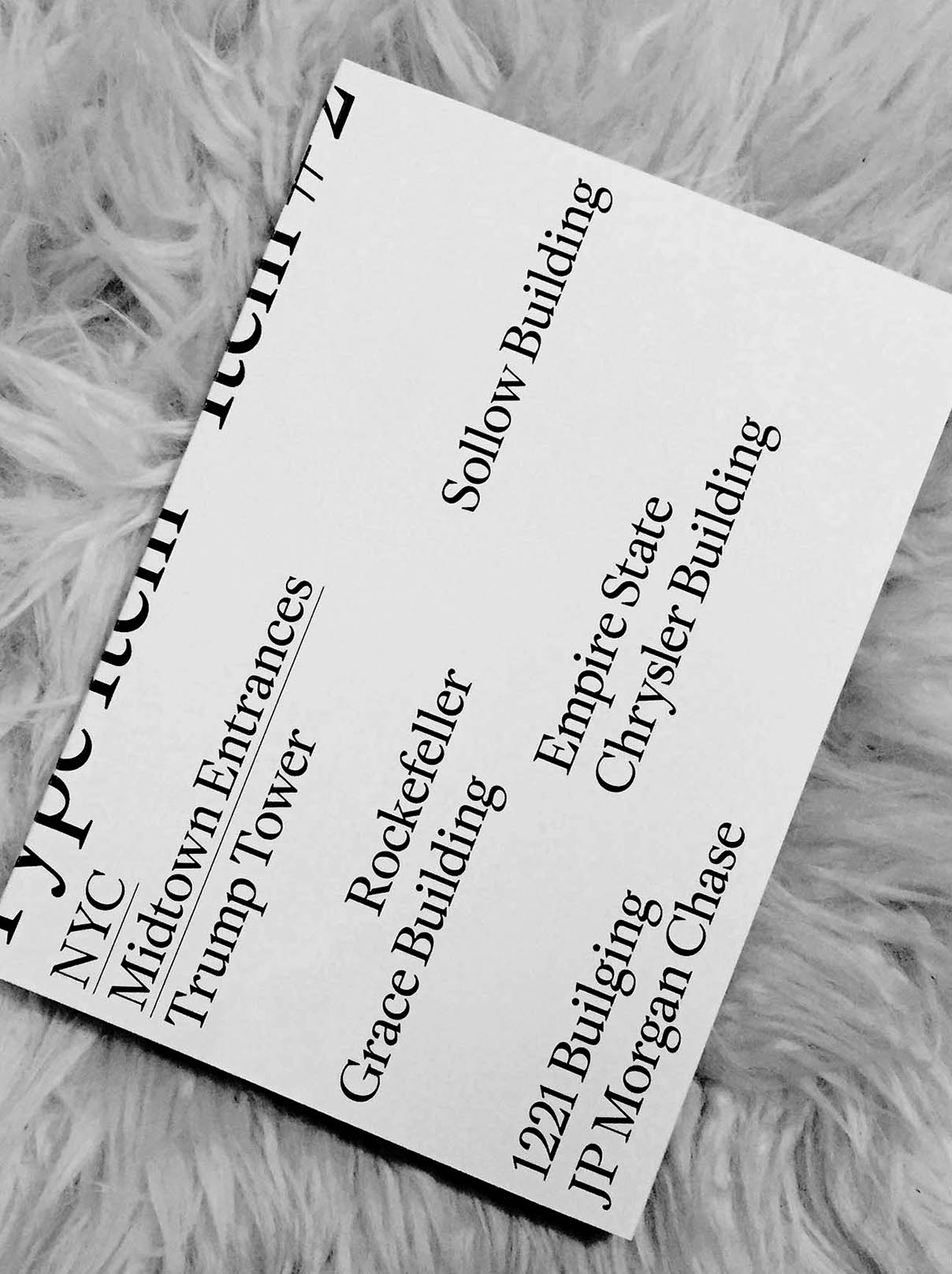
Type Item Number 2
NYC Building Interiors
2015
This project was based on a series of photographs of famous Manhattan buildings where photography was forbidden. The photographs, structured by 1 or 2 subjects, were all compared, giving rise to an observation exercise. This book was composed using the first drawing tests of ES Face, a typeface distributed by
Extraset type foundry.
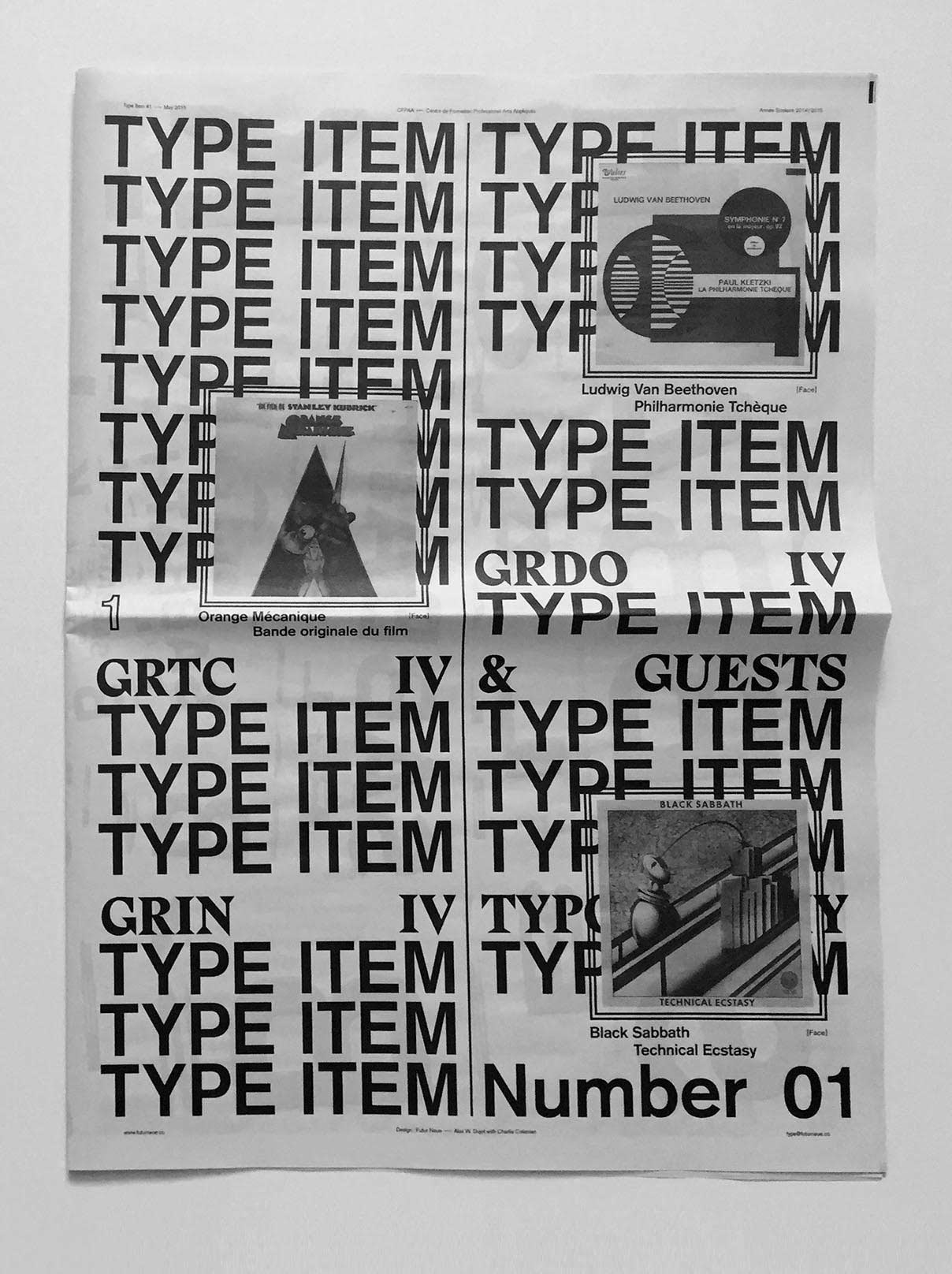
Type Item Number 1
Eponymous
2015
This paper archives an exercise of typography composition created by reinterpreting the visuals of vinyl sleeves. A typography course given at the CFP Arts Geneva with fourth year students.
Disclaimer: Any redistribution or reproduction of part or all of the contents of this website in any form is prohibited. You may not, except with express written permission, distribute or commercially exploit the content without the prior written permission of Futur Neue (Alex Dujet). Contact: Alex Dujet
type@futurneue.cc